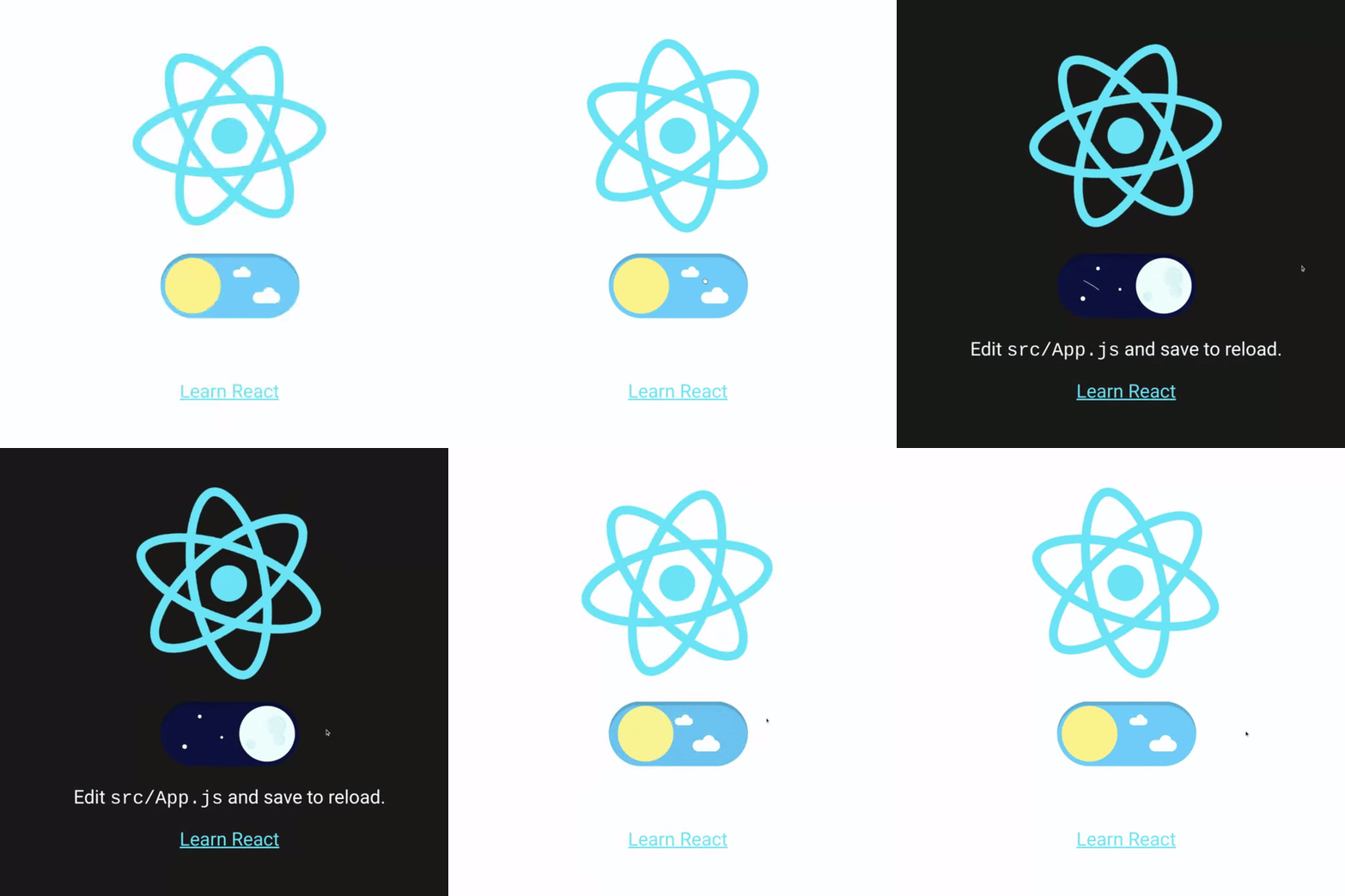
Dark Modes are all the rage, so I took it upon myself to add the functionality to this website. What follows is a brief explanation of how I got it working, in the hope that it might help those who may come across this post.
gatsby-plugin-use-dark-mode
If you are using Gatsby as your blogging engine, then you fortunately have access to a phenomenal set of plugins at the Gatsby Plugin Library. One such plugin is called gatsby-plugin-use-dark-mode. First, I added this via npm:
npm install --save gatsby-plugin-use-dark-mode use-dark-mode
A little explanation: use-dark-mode is a custom React Hook which aids the implementation of a dark mode component. Importantly, it features:
- Persistence between sessions
- Storage in
localstorage - Understanding of the users system level preference
On top of that, gatsby-plugin-use-dark-mode handles the injection of noflash.js, which prevents an unseemly “flash” of default styles if the user is using a system level dark mode and navigates to the site.
Once installed, some configuration is required in gatsby-config.js:
{
    resolve: `gatsby-plugin-use-dark-mode`,
    options: {
        classNameDark: `dark-mode`,
        classNameLight: `light-mode`,
        storageKey: `darkMode`,
        minify: `true`,
    },
},
Obviously one could change these options to anything, but I see no reason to alter them from the suggestions.
react-dark-mode-toggle
So far, so good. But how to let the user change the theme? You could add a pair of buttons and, if you were feeling fancy, you could label them with some Font Awesome icons. But why do something like that when react-dark-mode-toggle exists?

Implementation was simple. First, I created a new component called DarkModeSwitch.jsx and input the boilerplate code from the readme. The readme makes plain that the toggle is just a button (and recommends use-dark-mode as the management solution). So a quick look at the boilerplate in the use-dark-mode readme and I came up with this:
import useDarkMode from "use-dark-mode";
import DarkModeToggle from "react-dark-mode-toggle";

const DarkModeSwitch = () => {
  const darkMode = useDarkMode(false); //defaults to false
  return (
    <div>
      <DarkModeToggle
        checked={darkMode.value}
        onChange={darkMode.toggle}
        onClick={darkMode.value ? darkMode.disable : darkMode.enable}
        size={50}
      />
    </div>
  );
};
The point here is that use-dark-mode suggests a method with two buttons and a toggle sandwiched between. I prefer just the toggle switch since the current theme is so nicely integrated into the toggle itself.
Styling
At this point the toggle is working. But if you toggle it, nothing will change. You need to add the css for each mode.
In gatsby-config.js we defined two class names:
options: {
    classNameDark: `dark-mode`,
    classNameLight: `light-mode`,
We can use these in our scss—and we shall. By way of an example, consider the following:
::selection {
  background: $yellow;
  body.dark-mode & {
    background: $accent-color-dark;
  }
}
This defines the colour of the selection highlight. Normally it’s yellow, but when dark mode is enabled the body of our html has the class .dark-mode and in that situation, the $accent-color-dark colour is applied.
in standard css, it looks something like this:
::selection {
  background: #faed27;
}
body.dark-mode ::selection {
  background: #49aab7;
}
You can test this here of course. Select this paragraph and notice the selection highlight colour. Without deselecting, toggle the dark mode toggle and you will see it change.
Caveat
Such little code was required to get this working—the rough stuff was all taken care of. I simply called the component in my nav component and added a little styling to ensure it sits right.
On that note, there is one small caveat worth noting. To make sure it aligns nicely with the other list items, you must ensure that display: flex is present on the parent component of your toggle. That took a bit of figuring out, so don’t make the same mistake I did.
And that’s it. If you look to the navbar at the top of this site, you will see the toggle working.